OVERVIEW
This project aims to detail the steps taken in the development of a reading platform that caters to individuals with disabilities such as Amputation, Glaucoma, Cerebral Palsy, and Presbycusis, while ensuring compliance with the Web Accessibility Guidelines (WCAG).
USER REQUIREMENTS
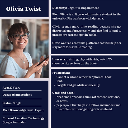
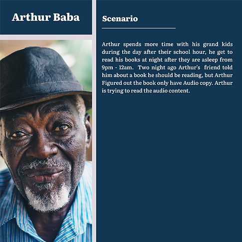
Four personas were developed, one for each impairment, to help foster inclusivity for people with different impairments. These personas include a user’s having disabilities such as amputation, Presbycusis a user with glaucoma, and a user who has trouble managing their time. Please see following images for further information about these personas in full. Five scenarios have been developed to specifically address problems with colour contrast, tool selection, navigation, communication, Special font selection, and bookmark function in order to meet the special needs of these users. Please refer to the images for more details on these Scenarios.





PAPER PROTOTYPE
The paper sketches display the preliminary designs and arrangements for the critical components of the Reading Application. The sketches showcase the essential features that are significant to the application, including audio transcribing, simple navigation, and the ability to minimize or maximize pages. All these crucial features have been incorporated into the application while following the WCAG guidelines for accessibility.


HI-FIDELITY PROTOTYPE
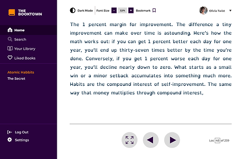
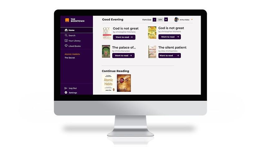
To ensure inclusivity and accessibility, the Reading web application was designed with various features to assist users with different disabilities. The application incorporates audio transcribing to aid users with presbycusis in accessing audio content. Additionally, to minimize eye strain and facilitate longer screen hours for users with glaucoma, a color contrast change adjustment feature was implemented. Furthermore, easy screen navigation was integrated into the application to enhance accessibility for users with cerebral palsy. A focus feature was also included to help users with dyslexia maintain their reading location and improve their reading experience. These accessible features were implemented with the goal of providing a seamless user experience for users with different disabilities, removing any barriers they may face.
Inclusive Design for Physical Impairments
Physical impairment refers to a condition or disability that affects a person's physical abilities or motor functions. It can manifest in various ways, such as limited mobility, impaired dexterity, or difficulty with coordination and muscle control. some common challenges include : Fine motor control, Coordination and Muscle Control, Response time and speed.
-
Users with cerebral palsy rely on accessibility features like voice control, switch control, or eye-tracking technology to navigate digital platforms. Lack of support for these assistive technologies creates barriers. Designing platforms with accessibility in mind, such as offering alternative input methods, optimizing button sizes, customizable settings, and compatibility with assistive technologies, improves accessibility for individuals with cerebral palsy. Inclusive design practices enable full participation in the digital world.
-
Enhancements have been made to the self-help book in the Reading web application, following WCAG guidelines. A dedicated page with chapter listings allows users to easily navigate and revisit specific chapters(WCAG 2.4.5 Multiple Ways), addressing challenges faced by disabled individuals who struggle with multiple clicks on the next-page button.
-
To minimize distractions and provide a focused reading environment, a zoom button was added to the screen. Activating this button hides most of the sidebar and navigation buttons, except the essential next-page buttons, complying with WCAG 2.2.2 (Pause, Stop, Hide) by allowing users to control the visibility of non-essential elements.
Inclusive Design for Visual Impairments
Visual impairment refers to the condition where a person experiences difficulties in perceiving visual information due to impaired vision. Glaucoma, a specific eye condition characterized by increased eye pressure and optic nerve damage, can lead to visual impairment. Glaucoma users encounter various challenges when accessing digital platforms. One major barrier faced by glaucoma users is reduced visual field, resulting in a narrowed range of vision.
-
This limitation makes it challenging for them to access content located outside their limited field, especially in complex layouts or peripheral information. Another barrier is contrast sensitivity, where glaucoma affects the ability to distinguish between colors or variations in brightness. Users may struggle with low contrast text or subtle visual elements, affecting their reading comprehension and perception of content. Glaucoma users often experience light sensitivity, making excessive brightness or high contrast interfaces with flashing elements uncomfortable or difficult to interpret. Additionally, small text sizes and icons pose difficulties for glaucoma users, as they may struggle to read or understand content presented in tiny fonts or unclear icons.
-
Lilly (From the persona) encountered difficulty reading small fonts and was restricted by her limited reading time due to reliance on her eyeglasses. To address this, an appropriate font style was selected, and the font size was made flexible, enabling users to increase it as necessary. This accommodation aligns with WCAG 1.4.4 (Resize Text) guidelines, promoting text scalability for improved readability.
-
Another beneficial feature for reading is the addition of a full-screen mode, allowing Lilly to read without distractions from the sidebar. This design choice ensures that the text occupies most of the screen, enhancing readability and reducing visual clutter. The full-screen feature aligns with WCAG 2.2.2 (Pause, Stop, Hide), which emphasizes the ability to hide non-essential elements to improve user focus.


Inclusive Design for Auditory Impairments
Presbycusis, age-related hearing loss, poses barriers for accessing digital platforms. Users struggle with higher frequency sounds, impacting comprehension of spoken content like videos, podcasts, or lectures. Reduced clarity, distorted perception, and the need for higher volume levels hinder their access. Background noise interference adds to the challenge, affecting their ability to focus on specific audio.
Arthur(From Persona), a passionate book enthusiast, faced challenges in enjoying his reading experience due to age-related hearing loss. His desire to access books available exclusively in audio format prompted the need for enhancements in existing audio book platforms.
-
Through thorough research and careful consideration of Arthur's requirements, a live captioning feature was implemented to improve accessibility for him (WCAG 1.2.4 - Captions, Live was followed). This feature synchronized highlighted words with the narrator's audio, allowing Arthur to follow the content visually. The choice of colors for highlighting was thoughtfully made to ensure optimal contrast with the background and accommodate individuals with color blindness.
-
To enhance navigation within the book, chapter navigation functionality was introduced (WCAG 2.1.1 - Keyboard was followed). This feature empowered Arthur to easily jump to different chapters, which proved particularly useful for self-help books or when revisiting specific sections.
-
Recognizing individual reading preferences and the need for adjustable narration speeds, an option to modify the playback speed was incorporated. This capability enabled users like Arthur to increase the narration speed, allowing fast readers to consume the content at their preferred pace.


Inclusive Design for Cognitive Impairments
Cognitive impairment refers to a broad range of conditions that impact cognitive abilities, including dyslexia, which specifically affects reading, spelling, and language processing despite normal intelligence levels. Dyslexia users encounter several barriers when accessing digital platforms. Firstly, they face difficulties in reading and comprehending written text, struggling with decoding words, recognizing letters, and understanding sentence and paragraph structures. This can make it challenging for them to navigate through digital platforms that heavily rely on written content.
Dyslexia users face visual distractions, with letters or words appearing to move or blend together. Complex interfaces worsen these challenges, affecting focus and navigation. Processing speed is slower, making quick-paced platforms or time-limited tasks problematic. Spelling and writing difficulties impact input accuracy, and inadequate autocorrect features cause frustration and communication errors.
-
To address these barriers and improve accessibility for dyslexia users on digital platforms, several measures can be implemented. Firstly, using dyslexia-friendly fonts and typography that enhance readability, such as fonts with distinct letterforms and sufficient spacing, can significantly improve legibility. Text-to-speech and speech-to-text support should be provided, enabling dyslexia users to have content read aloud to them and assisting them in converting spoken words into written text. These features help overcome reading and writing difficulties, respectively.
-
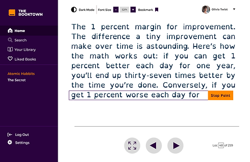
Olivia (From Persona), who has dyslexia, wanted to enjoy reading books without the challenges posed by her condition. The traditional font used in books proved distracting for her. To address this, a specially designed font (WCAG 1.4.3) was selected, following recommendations from sources such as the article "For Dyslexics, a Font and a Dictionary That Are Meant to Help." This dyslexia-friendly font improves readability by minimizing confusion and enhancing clarity, as it was developed by someone with dyslexia.
-
Moreover, Olivia expressed difficulty in focusing for extended periods on longer paragraphs. To support her reading experience, the font size was increased (WCAG 1.4.4 was followed), resulting in a view with fewer letters per line. Breaking the text into smaller chunks enables Olivia to maintain better focus, minimizing feelings of overwhelm and distraction.
-
In addition, Olivia had concerns about remembering her last reading position. To address this, a bookmarking system was implemented. A bookmark icon (WCAG 2.4.9 was followed) located in the top right corner highlights the line where the user last stopped reading. This feature allows Olivia to easily return to the exact spot where she left off, providing a seamless reading experience.